/*** Social share ***/
July 11, 2017

FIRST LOOK: Google's Updated Hotel Search/Review Interface May Surprise You

Arielle
 
Rubenstein
Read
3
min
Arielle
 
Rubenstein
Read
3
min

Google's stated mission is to organize the world's information and make it universally accessible and useful.That, of course, includes the manner in which the platform displays details on hotels.The tech innovators are at it again, testing an update to Google's hotel search result and review interface.A Google representative recently told SEO industry publication Search Engine Land, "When people are searching for a hotel to stay at, we want to ensure we make it easy for people to find useful and relevant reviews about that place to help them make informed decisions."Some of the core updates include;

  • Third-party reviews displayed in a carousel format for some listings
  • The review overview section has a more robust interface, bold color palate, and reviews by attribute
  • The detailed review section shows a graphical user interface based on type of travel

And, per usual, Google has thrown in other neat tweaks. Here’s our first-look breakdown.

Appearance

The Google aesthetic has always defined by its simplicity. Think of the original, streamlined Google.com homepage. It’s a constant reminder of the brand’s clean, uncluttered approach.

This makes it somewhat ironic that its the fresh visuals of the updated hotel interface that has caused a lot of buzz.

From the bold color scheme to the clearly represented graphics charts and displays, the visuals are decidedly fulfilling and have been well received, but the graphics do more than help this interface look good.

Practical

Friction is the enemy. We all long for ease of use. One benefit of the impressive graphic interface is that it aids navigation.

Selecting review category or choosing options such as location or availability is easy, in large part due to the visual access afforded by this new interface.

As would be expected, Google didn't fail to address the fact that we now live in a mobile-first world.

About 40% of this year's digital travel sales is expected to be made via mobile device, to the tune of about $190 billion. The graphics, layout and technology of this refresh work in perfect accord with mobile devices.

Informative
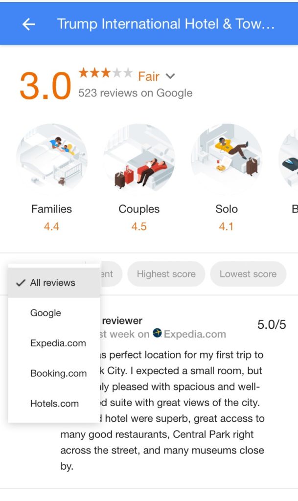
If guest reviews mattered before, they matter even more with this updated format.

User reviews are now broken out by attribute. While an "overall rating" still exists, ratings on various specifics of the stay are further segmented. For example, a hotel may have a 4.2 ratings for its service, but a 3.4 rating on its rooms. This should help hotel teams identify areas of service that need improvement.

Is your property a good fit for the business traveler? How about families? Google now shows review reviews based on the type of traveling people expect to do. In other words, hotels are now rated relative to how the hotel met the needs of their category of traveler.

Currently, travel categories include, family, business, solo, and couples. It is quite possible for a hotel to boast a 4.5 rating for family traveler, but a 3.2 when it comes to solo travelers.

Carousel of Third-Party Review Sites

No need to open additional tabs to cross-reference guest reviews from other sites.

The new format includes an interactive, third-party review carousel, allowing users to see stars from major review sites without having to leave their Google results page.

The Extras

Google appears to deliver with the essentials of its updated hotel review platform. It's got a beautiful, visually effective interface, its easy to navigate and informative. On top of this, Google has included some fresh bells and whistles.

One basic tweak is a local review feature that displays local feedback from people in that area. If you navigate into that review space, you may also notice some enhanced reviews or reviews that may be embellished with a chart or graph. It appears reviews now are incorporating Google's new Data GIF Maker trends visualization tool to help bring them to life.

And even farther behind the scenes, Google has been working on improving page-load times. So don't be surprised if details appear to load even faster than before when next visiting the hotel review interface.

For a quick-look at some of these new features in action, check out SEO specialist Sergey Alakov's website for a short video.Bottom line, Google is constantly testing and fine-tuning its hotel search interface, whether its the page placement of rates, where and how hotel properties are displayed, or the manner in which reviews are filtered and shared. The one thing that won't likely change is the company's penchant to change.For hotels, the update will more clearly showcase the property's strengths and challenges. Savvy hotel marketing teams will follow Google's future updates and discuss with their digital marketing partners, who can, in turn, help them take full advantage of the ever-changing state of search.

OUR BLOG

Related Posts

Related Posts

OUR BLOG

Related Post