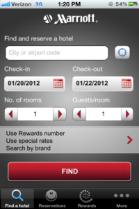
Marriott iPhone AppIn the spirit of making these reviews more interesting, I have developed a scale of greatness for the hospitality apps. Each app will be rated on three basic categories: appearance, functionality and amount of information for guest. By creating a simple platform to evaluate the different apps, we will start to develop an understanding of makes a truly great app. Our scale of greatness will range from somewhat mediocre to awesome. The levels from worst to best are somewhat mediocre, a bit better, pretty good and awesome.Now let’s move on to my thoughts on the Marriott app.I will begin by introducing you to the opening page of the app.

I am not moved by the graphics but the color theme fits the brand. It offers you an easy to navigate menu at the bottom of the app where you can find a hotel, look up reservations, sign in to your Rewards account or more options.Once you select your dates and location, you are presented with this menu. It is easy to navigate and I like that they can share new information such as “New Lobby”.

You can then select a hotel. I really like that each hotel has a photo gallery. This is a great selling feature as visuals are so important. Also, the hotel highlights provide pertinent information for the traveler.


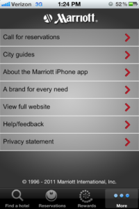
Finally, we are to my favorite part of the app – the “More” menu. I think this is a great idea as it sells the whole experience rather than just being a booking app. The guest can find important phone numbers and city guides. You can also provide feedback on the mobile app, helping Marriott to improve its service and making the guest feel important. Well done!

I would like to conclude with my ratings of this app on my newly developed scale of greatness.Appearance – Pretty GoodFunctionality – Pretty GoodAmount of information for guest – Awesome! – due to the City Guides!Hopefully, you have found this review helpful. Stay tuned for more reviews. Please let us know if you have an app you would like us to review.


