/*** Social share ***/
October 31, 2018

New Look for Google Hotel Search Results

Brett
 
Perry
Read
3
min
Brett
 
Perry
Read
3
min

For months Google has been testing new user interface designs for their hotel search results on mobile and desktop devices. Mobile was first to get a facelift, and now the desktop interface has a new design.Just this week,Google released a new desktop version of their hotel search results, emphasizing imagery and increasing the importance of GMB profile management.Why the new design? Google hopes to provide an improved user experience (UX) for users looking to book a hotel. The stronger emphasis on imagery, user ratings and other information from hotels' GMB profiles in this latest update aims to give users a better understanding of each property while comparison shopping.Let's take a deeper dive into the new-look hotel search results.

Results Page Design

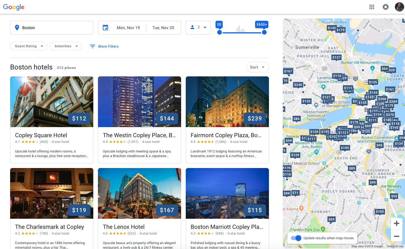
When searching for “Boston Hotels”, this is what the new results page looks like. It provides users with date, price and other new filtering options, as well as displays results in the more visual grid.
Hotel Profile Page:

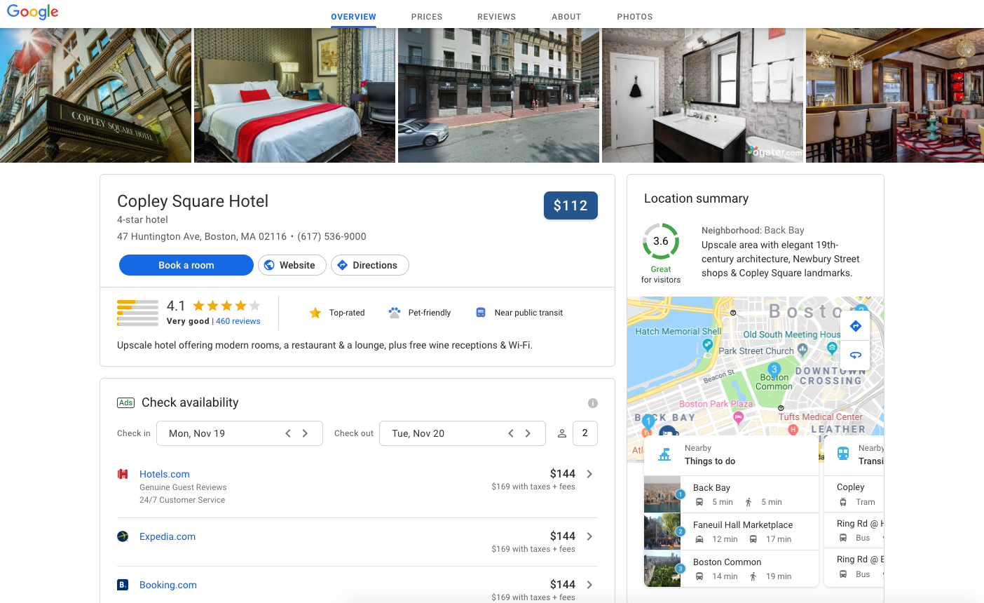
Once a user selects a hotel, they are then led to the hotel profile page, which now offers a one-stop shop for all things related to the property including prices, photos, and reviews. Google has also added a new section called "Location Summary," which highlights nearby attractions and transportation landmarks. This could help properties in urban areas highlight the benefits of their location, as well as make it significantly easier for users to get location information beyond the traditional street address. The highlighted amenities next to the star rating underscore the growing importance of maintaining and updating property GMB profiles.
How Does It Affect You?

For most hotels, this design change could certainly impact the number of bookings they receive. After months of testing, Google found this design to provide the best UX, and a better UX improves the likelihood of a booking. The "Book a Room" button and meta search results are also prominently featured, providing users with multiple booking paths, which also increases the likelihood of a user booking.This update puts a greater emphasis on ensuring your Google My Business profile is constantly monitored and updated, including property images. The update also increases the importance of proper meta search management.At Screen Pilot, we are constantly monitoring Google My Business profiles for updates from our clients or from Google, as well as optimizing our clients' meta search campaigns to ensure no opportunities are missed.

Did you enjoy the read?

Get original hospitality industry insights delivered to your inbox. Sign up to receive Screen Pilot’s #TrendingNow Newsletter.

OUR BLOG

Related Posts

Related Posts

OUR BLOG

Related Post