A hotel’s website is its digital lobby. And not unlike a well-designed lobby, the most successful hotel websites are equal parts storyteller and moneymaker, showcasing a “sense of place” while offering information.The most inspirational hotel websites do even more. They sell an experience.To reach this digital apex, a hotel’s website must be built on certain standard elements of web design:
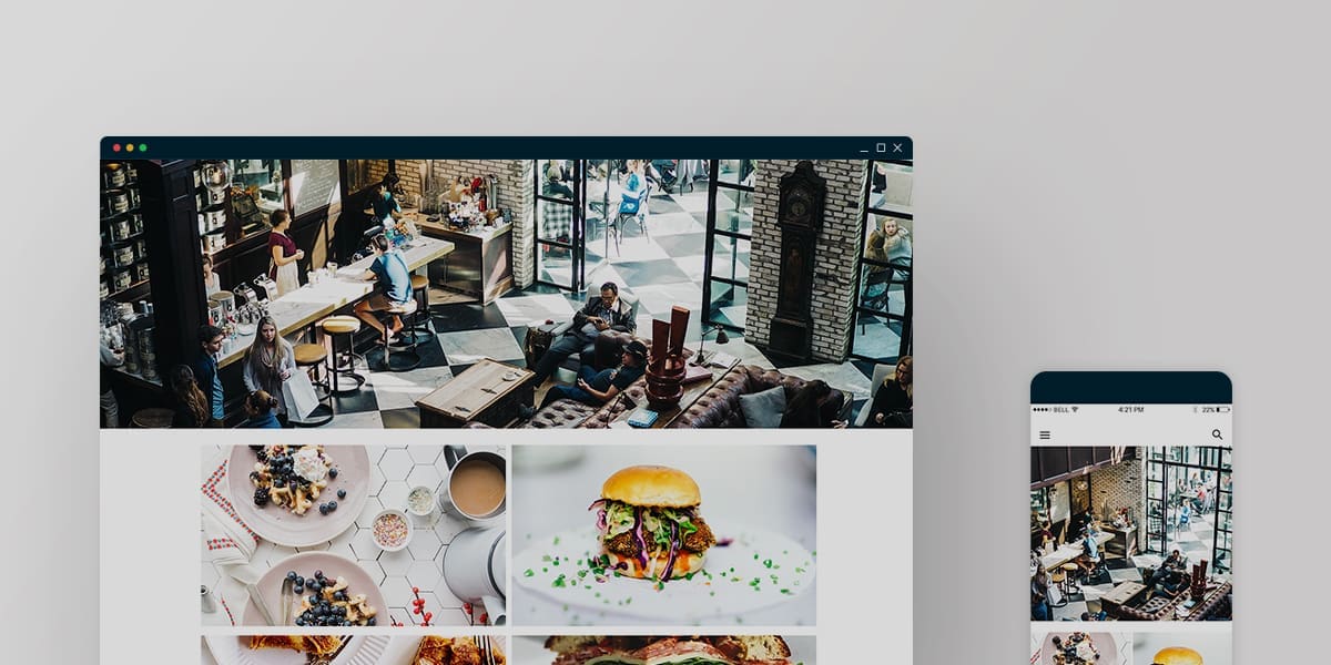
RESPONSIVE DESIGN: This means that the website must be viewable across devices without losing functionality or breaking. Regardless of screen size, the site will adjust accordingly and the online experience will be as pleasing on a desktop as it is on a mobile device.
SUPERIOR UX: Understanding how a visitor naturally wants to navigate through a website and making that flow easy is the hallmark of a good user experience (UX). If it’s difficult to find common pages or get to the booking engine, it’s likely that your potential customer will become frustrated and simply give up.
STORYTELLING: Does your website accurately communicate the guest experience? Does it educate on possible itineraries and encourage daydreaming? The better a traveler can picture themselves somewhere doing something they enjoy, the higher the chance they will buy a product or book a room.
EASE OF BOOKING: To put it bluntly, if a booking engine requires any additional steps beyond the basics of room type, guest name and contact information, and payment, you risk the loss of bookings. Simplify the booking process as much as possible for the greatest return.
ADDED VALUE: Many hotels have jumped on the organic farm-to-table train, keeping gardens of their own and integrating their harvests in the property’s recipes. Other hotels have a coveted golf pro or bartender. Take advantage of what makes your brand special. Post regular blog updates or videos that entice website visitors to return often, whether it deals with growing your own spice garden or perfecting your golf swing. This builds trust and starts conversation between you and your website visitors and keeps them coming back for more.
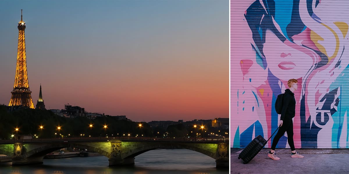
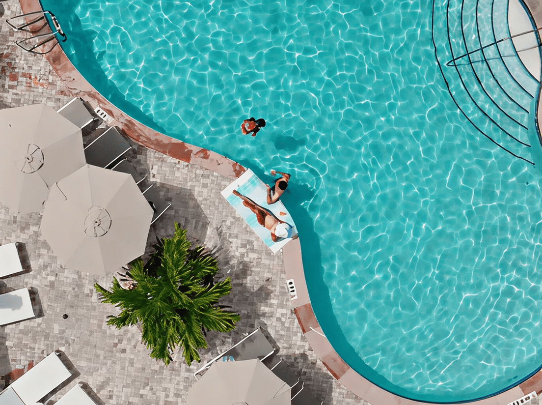
COMPELLING VISUALS: The best and most effective websites are the ones that entice the visitor to spend time exploring. Professional photography and video are both great mediums for storytelling, especially for hotels and resorts. It sets expectations for what guests should plan to experience when they are on property while also allowing themselves to picture themselves in a certain room, relaxing by the pool, or enjoying a cocktail while admiring that fabulous view.
With so much invested in a property’s online presence, it’s a shame when elements are absent. All too often we find hotel websites that are stunning to scroll through, yet lack fundamentals, like a sticky header, or an omnipresent option to book. When all six design elements work in harmony, however, it inspires. Here are ten hotel and resort websites that got it right.
The Garland
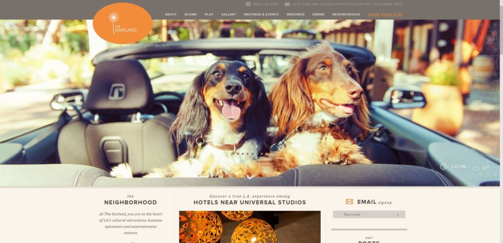
Highlights: At first glance, the amount of content on the homepage is surprising, but once you realize the offerings are relevant and displayed in a clean, magazine-style layout, surprise turns to intrigue.It’s clear the marketing team did their research and offer their most engaging content early to entice potential guests to take a longer look.
Five Seas Hotel Cannes

Highlights: The full website for this French property offers feel-like-you’re-there photography and a beautiful flow. The design team did a great job adjusting the photos and content for the mobile experience, as well.
Mohonk Mountain House
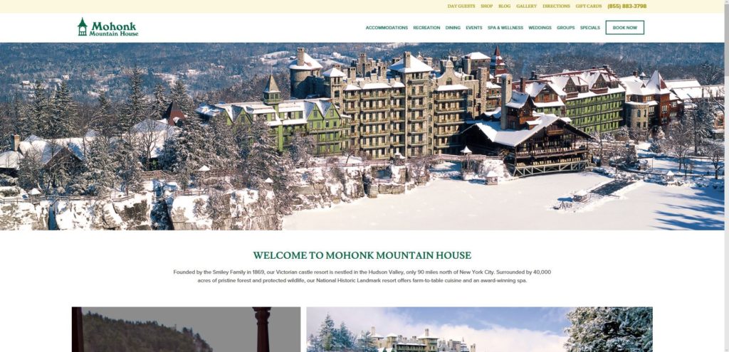
Highlights: With its Instagram feed prominently featured and a revealing layout on its homepage, this Screen Pilot client has a website that is as hard-working as it is beautiful. The property offers myriad accommodation options, but the user experience (UX) design takes something complex and keeps it simple, while simultaneously offering an informative, aesthetically pleasing scroll.
Mandarin Oriental, Bangkok

Highlights: The Mandarin Oriental’s site offers strong storytelling, immersive imagery and a layout that flows. A visit to the homepage leaves travelers longing to explore more.
The Naka Island, Phuket
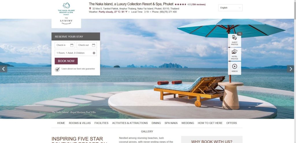
Highlights: The major hotel teams have become adept at taking what the OTAs (online travel agencies) do best and applying those features to their own site. This Marriott property mimics many of the easy UI/UX features of an OTA – featuring special rates, amenities, reviews and an uber-easy path to booking.
Ocean Edge Resort & Golf Club
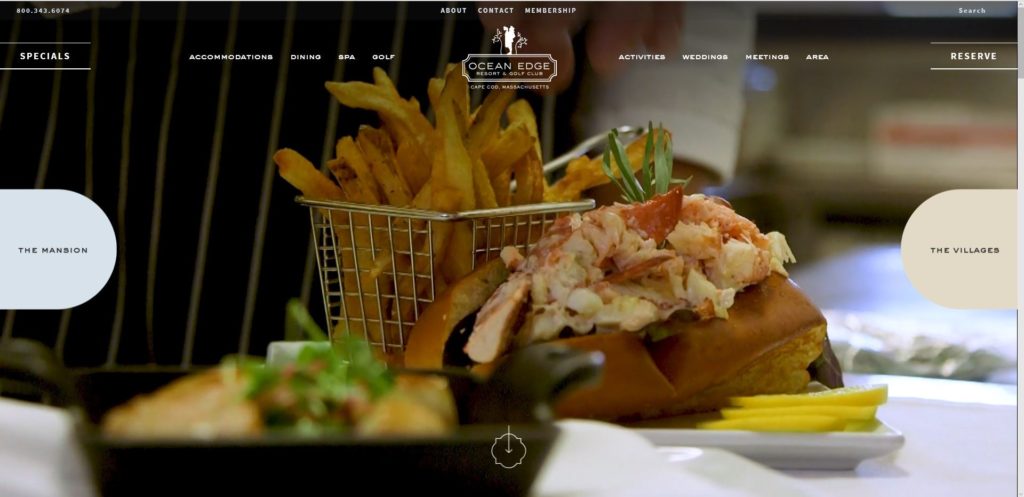
Highlights: This property is all-in on video, and integrates it well into the homepage.The desktop browser is greeted with a full-screen video that instantly offers a feel for the property and surrounding area, and overall UX feels organic and fun, while at the same time selling the guest experience. Beyond that, everything above the fold is sending you off where you need to go (test out their expanding navigation options for “The Mansion” and “The Villages – we’re big fans). It’s a complex property, and yet you never feel distracted or overwhelmed on their site.
Hotel Valley Ho
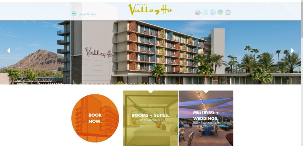
Highlights: This Scottsdale property’s site clearly reflects its brand. Further, this is a strong example of “mobile first” design, optimized for smaller screens, but not at the expense of the desktop experience.
San Francisco Proper Hotel
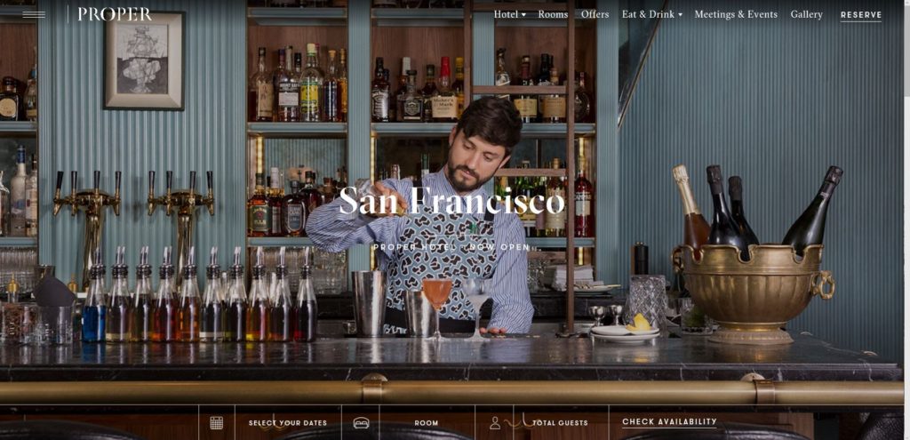
Highlights: Sharp, elegant, easy to navigate. This property’s site offers a balanced mix of light content and visually enticing imagery.
Grand Hotel Tremezzo
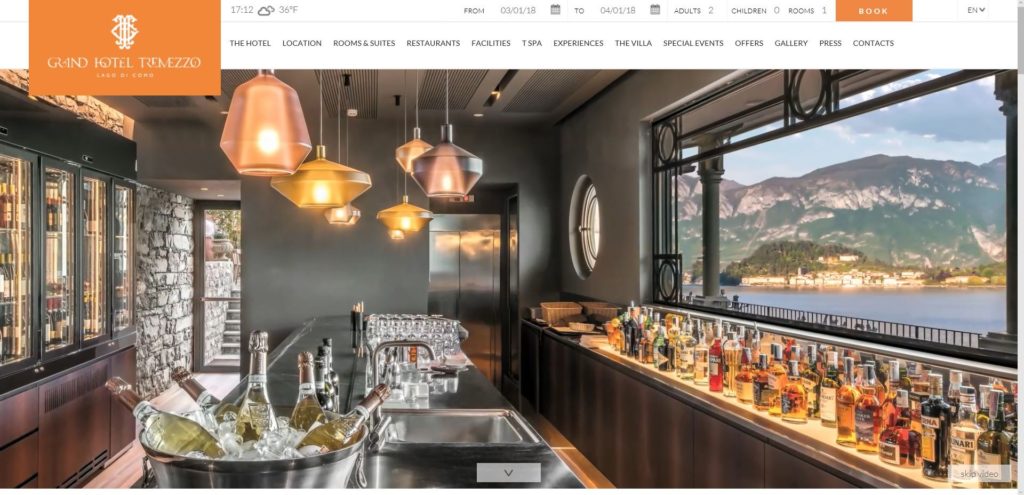
Highlights: This Italian property offers savvy integration of user-generated content (UGC), and we really love the postcard option on the homepage. It’s a nice blend of classic and new, much like the property itself.
Graduate Tempe
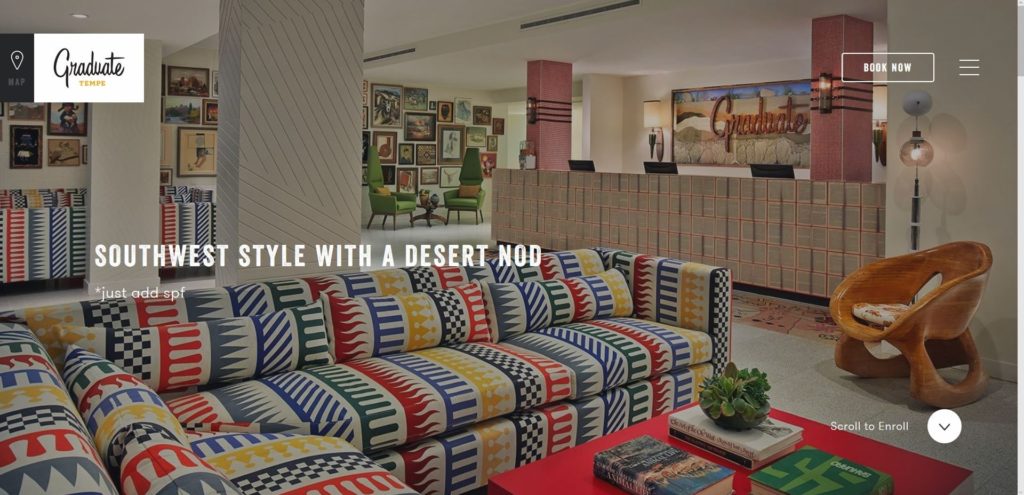
Highlights: This Graduate site offers an original integration of booking engine and they clearly know their audience and have fun with their brand. Navigability gets a bit tricky the deeper you get, but they do all they can to drive conversions early, and you don’t have to dive deep to understand the guest experience.
Did you enjoy the read?
Get original hospitality industry insights delivered to your inbox. Sign up to receive Screen Pilot’s #TrendingNow Newsletter.

