Updated January 3, 2018. Check out 10 new examples of inspiring hotel website design here.
When was the last time you made a reservation for lodging somewhere that didn’t have a hotel website?
Recently, I rented a cabin in the remote Colorado wilderness during peak leaf season, and the only place that had any availability was also (not surprisingly) the place without a website. The direct correlation between bookings and hotel websites cannot be denied.We no longer live in an age where a compelling and inspirational hotel website is a nice to have – now it is a must-have. If you aren’t online, your brand simply doesn’t exist to one of America’s most influential groups, millennials. Meanwhile, as OTAs gather around the booking table for a slice of the pie, they bring with them gargantuan marketing budgets that most hotels can’t compete with. Hoteliers must level the playing field where they can, and for many, the best place to start is with their website. Only hotels and resorts truly know how to tell their stories and frame their unique value proposition to their guests.When a hotel is found on an OTA or metasearch engine it is reduced to only a handful of pictures and minuscule property description. A website, on the other hand, can become a journey to the heart of a brand. It can quite literally tell the story of a guest’s stay, focusing on amenities, attractions, and everything else that is compelling about their trip. Inspirational hotel website design sells far more than just a place to lay your head; it sells an emotion, a dream, an entire journey.If hotels can offer travelers a superior online experience, the traveler will naturally associate that emotion with the brand itself building loyalty and driving conversions. However, compelling hotel website design isn’t as easy as waving the magical marketing wand and shouting a spell you once read in a Harry Potter book. It requires a lot careful planning and a strategic understanding of the customer’s path to purchase. There are a number of different qualities that some the best and most inspirational hotel websites share, and if any of them are ignored then brands run the risk of not only losing bookings but customers who navigate away never to return.
Contact us today to discuss your property’s website design and digital marketing strategy.
Websites that want to make a statement, pack a punch, or whatever other cliches you wish to use, must focus on the following six elements of web design:
- Responsive: This means that the website must be viewable across devices without losing functionality or breaking. No matter the screen size, the site will adjust accordingly and the online experience will be just as pleasing on a desktop as it is on mobile.
- Superior UX: Understanding how a visitor naturally wants to navigate through a website and making that process easy are all hallmarks of good user experience. If it is difficult to find common pages or get to the booking engine to complete a purchase, it is likely that your potential customer could become frustrated and simply give up.
- Storytelling: Does your website give a clear idea of what life will be like once a guest is on property? Does it explore possible itineraries or open the door for daydreaming? The more someone can picture themselves somewhere doing something they enjoy, the higher the chance they will buy a product or book a room.
- Ease of Booking: Not much of an explanation is needed for this one. To put it bluntly, if a booking engine requires ANY extra steps beyond the basics of room type, guest name & email, and payment info, then it will not be effective. Simplify the booking process as much as possible for the largest return.
- Added Value: Many hotels have jumped on the organic farm-to-table train, keeping gardens of their own and integrating their harvests in the property’s recipes. Other hotels have a coveted golf pro or bartender. Take advantage of what makes your brand special and milk it dry. Post regular blog updates or videos that bring some kind of added value to website visitors whether it deals with growing your own spice garden or perfecting your golf swing. This builds trust and starts a conversation between you and your website visitors and keeps them coming back for more.
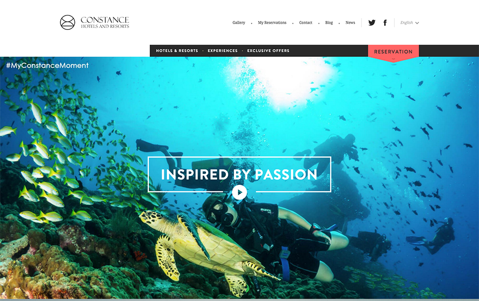
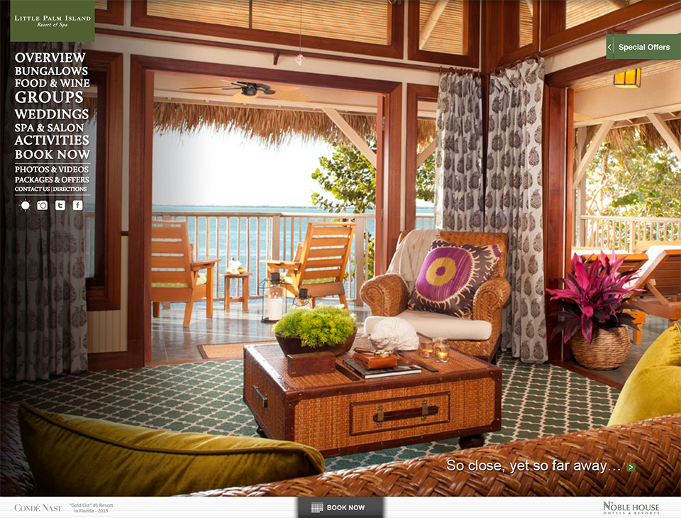
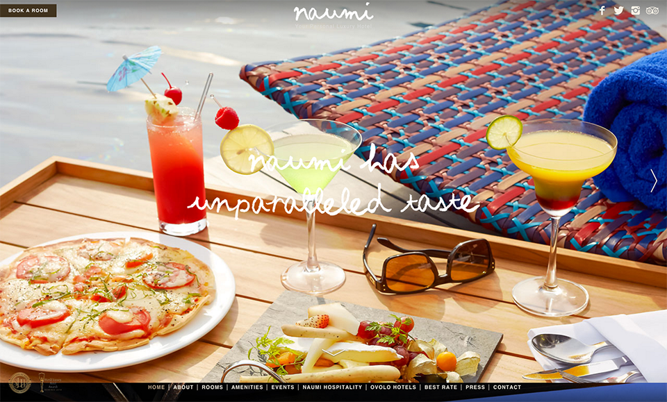
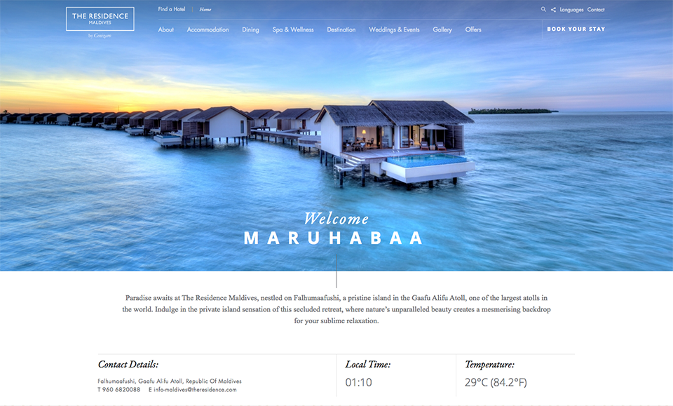
- Visually Compelling: The best and most effective websites are the ones that entice the visitor to spend time exploring. Professional photography and video are both great mediums for storytelling, especially for hotels and resorts. It sets expectations for what guests should plan to experience when they are on a property while also allowing themselves to picture themselves in a certain room, laying by that gorgeous infinity pool, or sipping a martini while admiring that fabulous view.
Still having trouble picturing the whole package? Here are 21 hotel and resort websites with designs that are sure to inspire you, and possibly give you a little bit of wanderlust.
Click through for the full website experience.
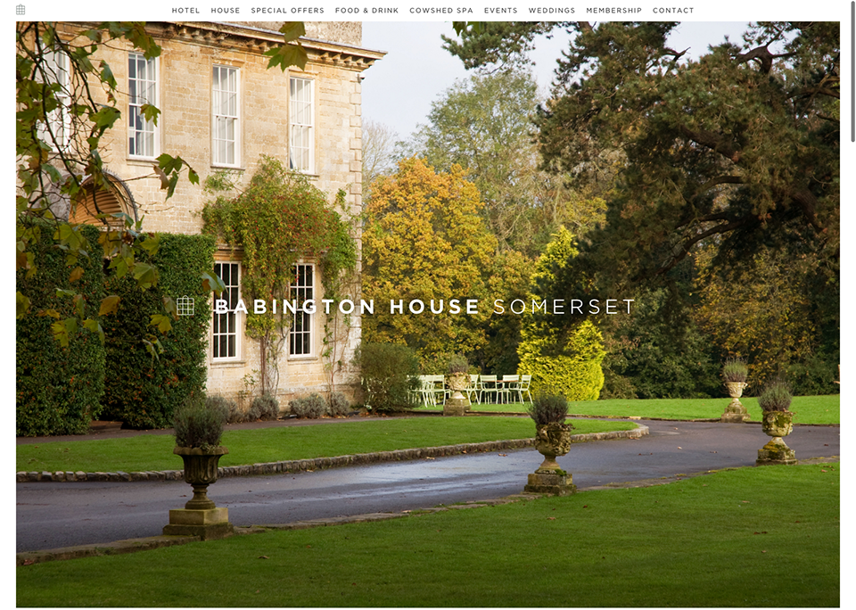
1. Babington House
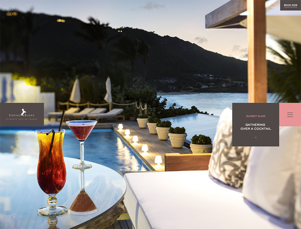
2. Cheval Blanc St. Barth’s
3. Constance Hotels & Resorts
4. Downtown Grand Las Vegas

5. Gramercy Park Hotel

6. Grand Hotel Tremezzo

7. Palazzo Ravizza

8. Little Palm Island Resort & Spa
9. Naumi Hotel
10. The Residence Maldives
11. Vesper Hotel

12. The Maritime Hotel

13. The Garland
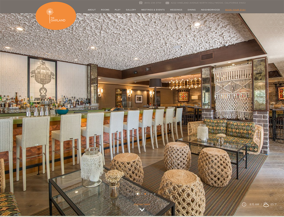
14. The Chess Hotel
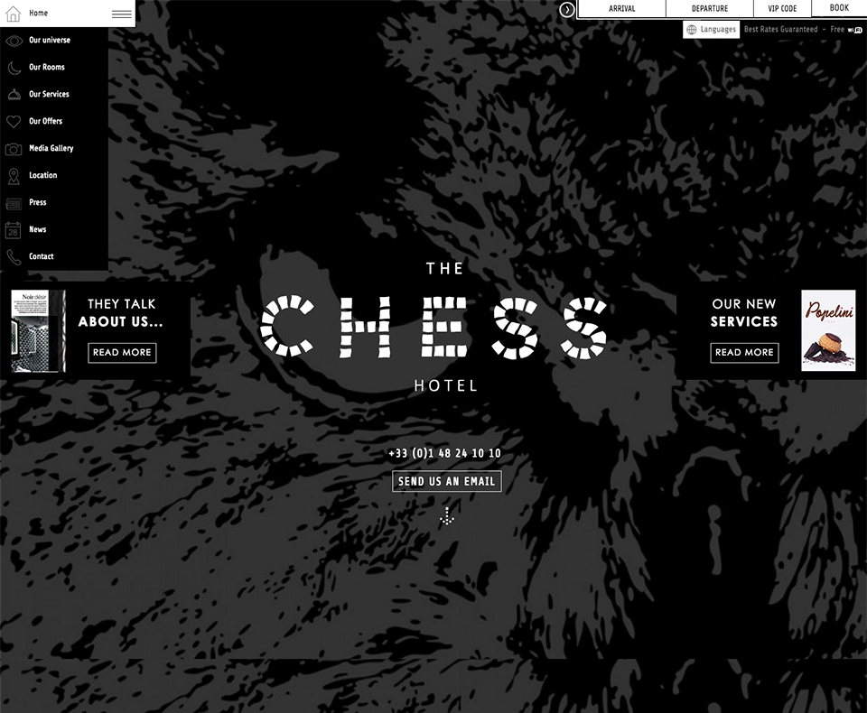
15. Solange Calistoga
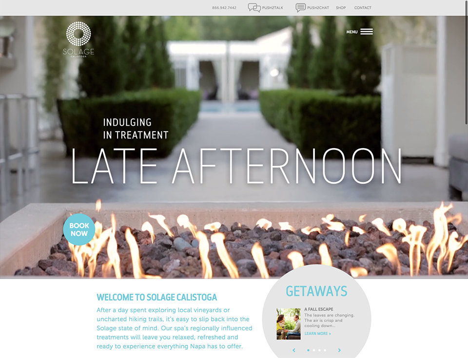
16. Regnum Carya Golf & Spa Resort
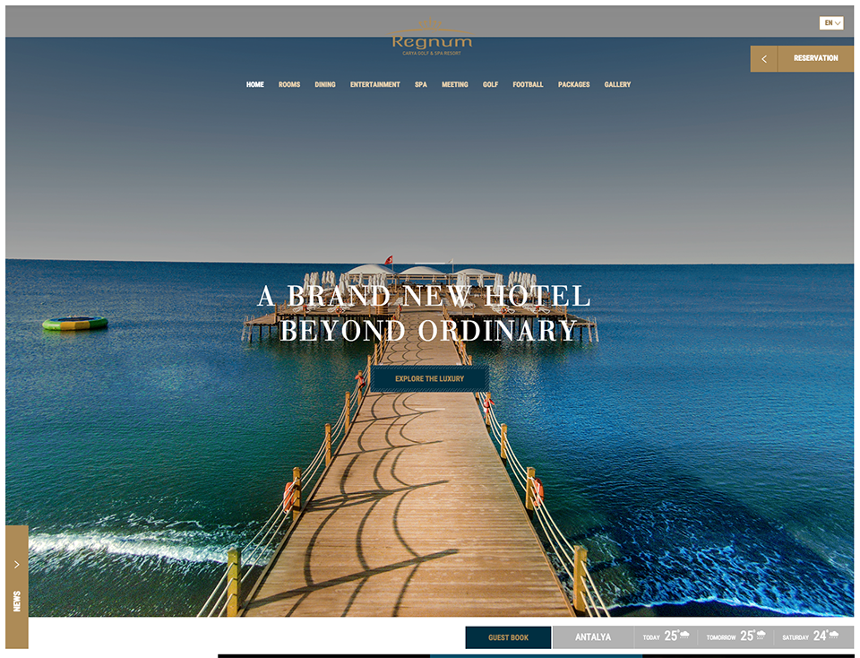
17. Murmuri Hotel
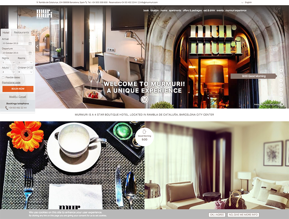
18. The Jade Hotel

19. Maison Bertine
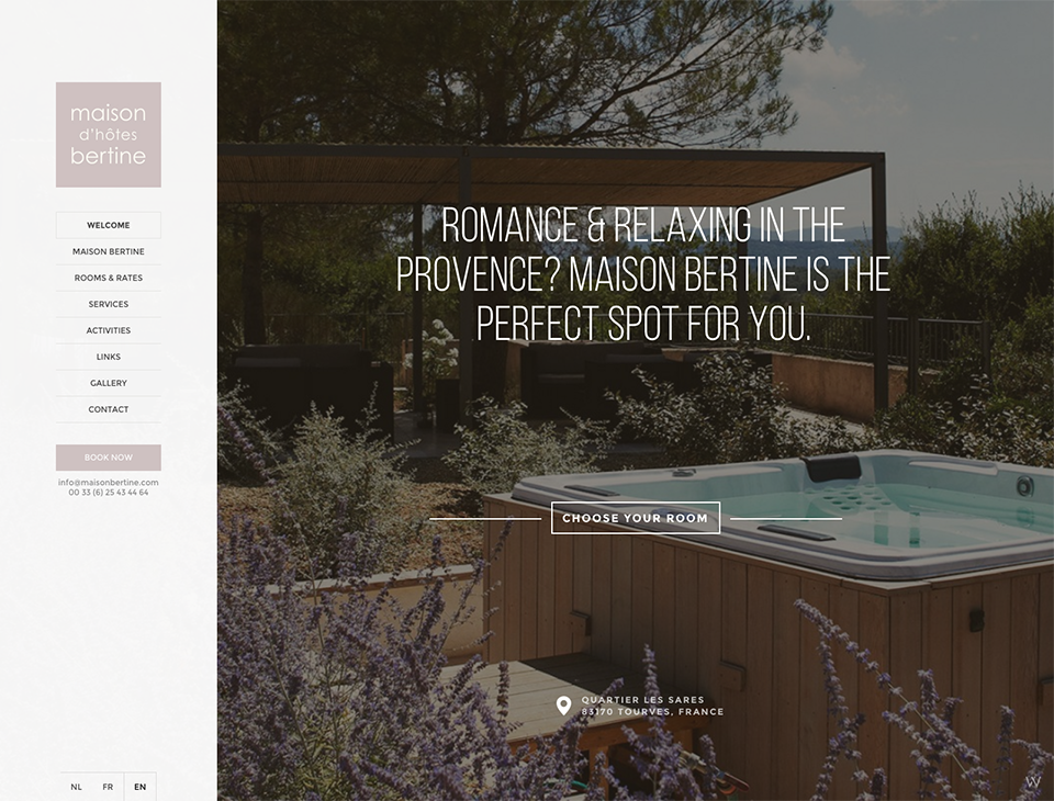
20. Christchurch Harbour Hotel & Spa

21. Fellah Hotel

If you have any questions about web design or are curious about whether or not your website could use a little help, don’t hesitate to ask. That is what Screen Pilot is here for after all.
Did you enjoy the read?
Get original hospitality industry insights delivered to your inbox. Sign up to receive Screen Pilot’s #TrendingNow Newsletter.


