/*** Social share ***/
November 20, 2019

Instagram Series Part 2: Why (and How) to do an Instagram Grid Takeover

Brett
 
Perry
Read
3
min
Brett
 
Perry
Read
3
min

Using visual storytelling through a design-first Instagram profile can help hotels stand out in a crowded space of like-minded content. Whether it be accommodations, amenities, special promotions, or food and beverage features, utilizing an Instagram Grid takeover is a great way to show “wow factor”. This method can also help to increase the longevity of photography assets and give followers more reason to view or swipe through multiple posts, boosting engagement metrics.In this second part of our three-part blog series, the Screen Pilot Social Media Team explores ways that brands can improve engagement metrics with unique content - specifically through the use of Instagram Grid takeovers.

WHY DESIGN-FIRST INSTAGRAM GRIDS HELP

  1. With over 800 million active users, a grid comprised of well-chosen images and content creates a “digital mood board”. This encourages users to scroll deep through the feed - an experience that helps visualize being at the resort or reminisce about a past trip.
  2. Hotels are able to increase the longevity of the property’s photos with a grid format, especially if they lack sufficient professional photos or UGC content.
  3. The use of a well-curated feed, with frequent posts, will help build upon the engagement Instagram Stories already bring to an account, as discussed in Part 1 of this series - The Power of Instagram Stories.

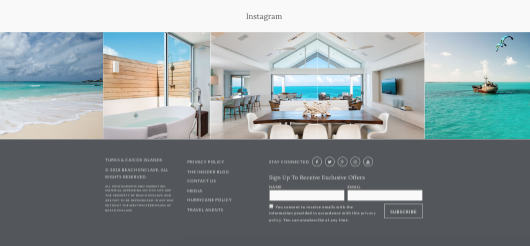
Pro Tip: Display a curated and design-forward feed on your resort website in an aesthetically-pleasing way like Turks & Caicos hotel Beach Enclave has done (seen below).
HOW TO BUILD A GRID

Before designing a grid, research and understand the hotel’s social media style and aesthetic. This is important for creating a “digital mood board” that prompts users to scroll the feed.

Step 1: Develop an aesthetic for the grid

Determine the brand filter preset (a Screen Pilot recommendation is to use either VSCO or Adobe Photoshop) that fits the hotel's Instagram account, and keep it consistent. Sixty percent of brands use the same filter for every post - which helps to increase brand recognition.

Step 2: Choose the best grid design based on the brand and available content

It’s important to choose high-resolution images that, when broken into a grid, could still function as an aesthetically appropriate post on its own. This way, when the image is put together and posted as a grid, it forms a cohesive story and does not spam followers.Different ways to integrate this grid strategy include:

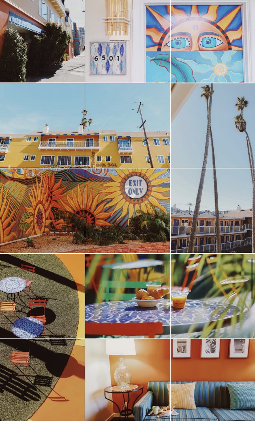
  1. Vertical/Horizontal - Alternate between vertical and horizontal photos to create a dynamic feed layout with multiple images telling a story. The SCRL mobile app can cut photos into segments and save “scrolling videos” for easy photo/video integration in the feed.[caption id="attachment_7029" align="aligncenter" width="280"]
Instagram example of a Grid Takeover layout
  1. An example of vertical and horizontal storytelling used at the same time to display multiple aspects of a resort. Pictured here: Hotel Del Sol[/caption]
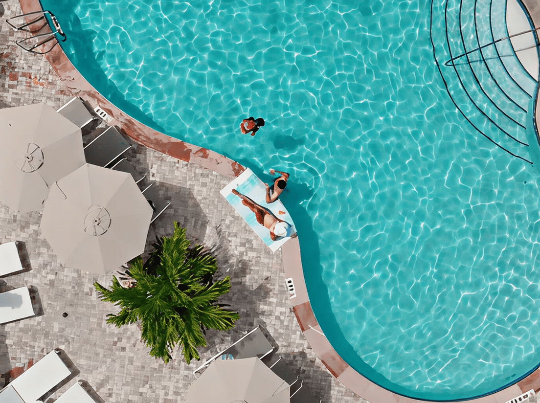
  2. “Across" the grid - Sticking to horizontal 3-square images or 6 images by using PhotoSplit for 6-tile photos is perfect for design-focused properties looking to showcase high-resolution shots.[caption id="attachment_7032" align="aligncenter" width="282"]
  1. An example of displaying "Across the Grid" to show a panoramic scene at a resort. Pictured here: Beach Enclave[/caption]
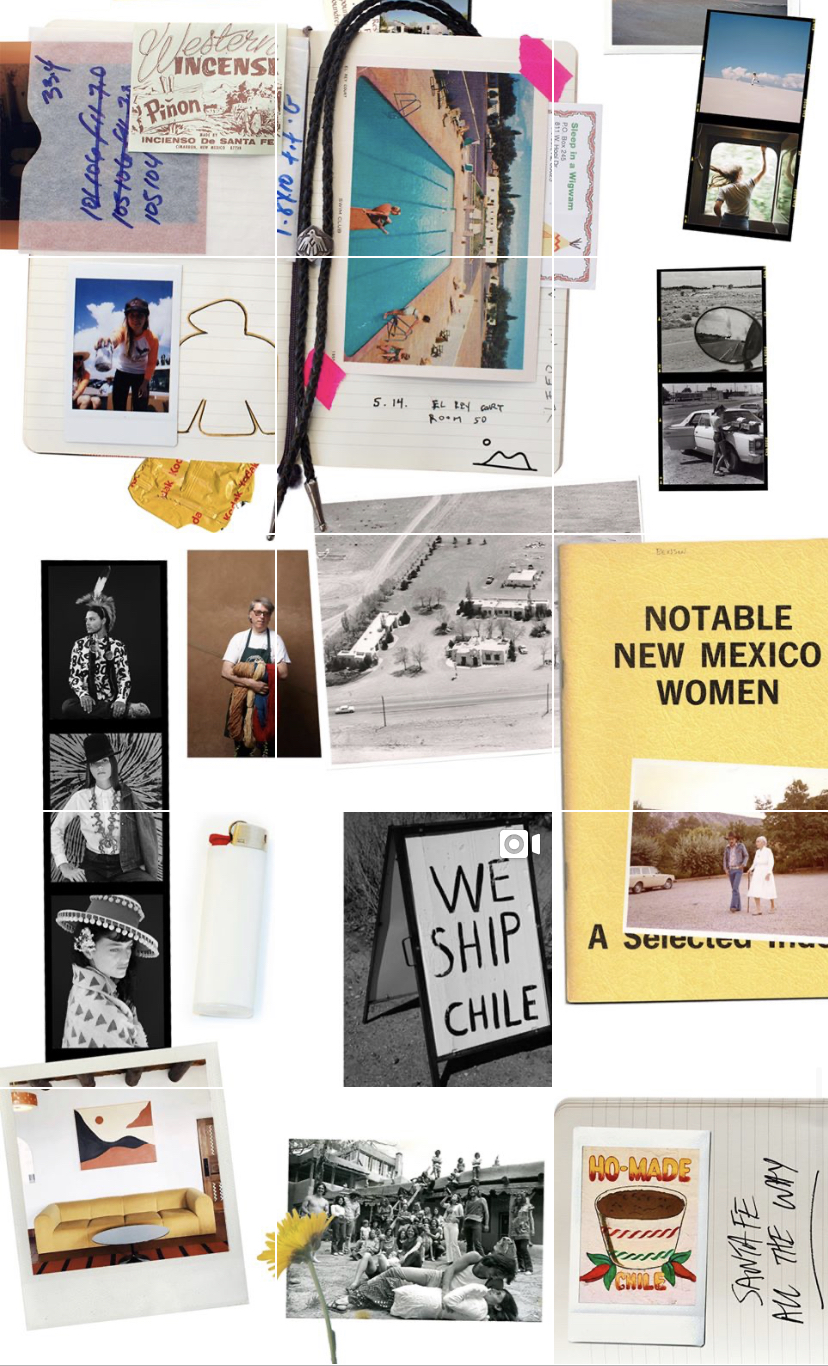
  2. “Puzzle” grid - This can create a static feed and works best for a product launch or for hotels that like to solely focus on Instagram Stories, just as El Rey, pictured below.[caption id="attachment_7031" align="aligncenter" width="279"]
  1. A "Puzzle Grid" layout used in a static Instagram feed.[/caption]

Step 3: Plan

Once it’s been decided what type of grid will work best, the next step is using the right application to plan the grid, making it possible to visualize the holistic grid strategy. Here are some applications that work on mobile and desktop that help users do this:

  • Planoly - Add “placeholders” for future content to maintain the grid. Planoly allows users to split images when uploading content onto the App from a phone. Users can also keep the brand on point for both Stories and IG feed posts alike - with branded Story templates, hotels can plan a Story series as well.Note: Publishing content will still need to occur via a mobile device due to Instagram’s API
  • Latergram - Latergram allows users to not just visually plan Instagram, but also schedule and analyze posts for Facebook, Pinterest, and Twitter also.
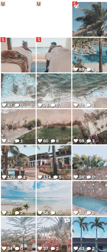
[caption id="attachment_7030" align="aligncenter" width="254"]

An example of a resorts use of an Instagram Grid in Planoly[/caption]

What’s next?

Next week, the final part of this series will highlight how showing off a property’s guest offerings with a sweepstakes can significantly boost and recover the engagement metrics.

Did you enjoy the read?

Get original hospitality industry insights delivered to your inbox. Sign up to receive Screen Pilot’s #TrendingNow Newsletter.
OUR BLOG

Related Posts

Related Posts

OUR BLOG

Related Post