/*** Social share ***/
You can relax, we won’t be peppering this blog entry with Clint Eastwood and cowboy puns! Earlier this year we introduced you to QR Codes as a means to link your offline and online marketing efforts. In case you didn’t see that or need a quick catch up then check it out here. Since then QR code use has mushroomed. A recent report showed that QR code use has increased by over 4000% since 2010.That increased use has meant that we have seen QR codes out and about a lot more recently. Here’s what we’ve seen around over the last few weeks…Caribou Coffee – Caribou are using QR codes as part of their “Stay Awake For Summer” ad campaign.
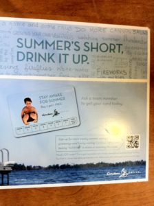
Firstly the good – QR codes are still relatively new to most of the general public. Therefore it’s vital that, for now, we explain to consumers what they are and how to scan them in a simple and concise way. Caribou have done a great job of this. They explained what was needed and where to get a free reader.They also incentivized the marketing message giving the consumer a reason to use the QR code – “Sign up for more weekly summer savings”. Most consumers won’t scan the QR code just because it’s a cool new tool.Now for the bad – This can’t be seen from our photo but the signs were placed in awful locations. The codes need to be easily accessible and in obvious places. Caribou started well by placing the signs on a few tables. However there were also signs behind the counter and on the wall behind tables (blocked by other customers). And they were the 2 most obvious in the store.The Hilton, Hilton Head Island – Unfortunately this was ugly pretty much all round. The only positive we can give is that the QR Code was very obvious and stood out. Everything else was poor – No explanation of what it was, no incentive to scan, it didn’t offer a free reader and it was in a pretty odd location (down a hallway in the middle of the resort). The sign didn’t even look professional; it was pretty much just a print out stuck to the wall. All in all a very odd piece of marketing.Old Navy – Hazaa! By far the best use of QR codes we have seen. The codes were used as part of a competition to win tickets to the MLB World Series. The execution was superb. Signage was in all the best locations – Front door, by checkout and by the changing rooms. Everywhere customers were likely to stop for a few moments there was a sign.They explained the code well, they incentivized it and their mobile landing page was simple and easy to use. As a campaign for generating customer email addresses it was seamless from beginning to end.Have you seen any good or bad uses of QR codes out and about recently? Comment below and let us know. And if you’re thinking about implementing them in your upcoming marketing efforts then get in touch. We’d love to have a chat about what can be done.